The project
Rad Rat Comics is my own YouTube channel, where I dig into old comic books and the strange, funny stories hidden inside them. As a personal project, it gave me the chance to design a brand for an audience I know well, because I’m part of it.
The challenge
A comic book channel lives or dies on whether comic fans feel at home the moment they see it. The logo had to speak their language, feel authentically retro rather than like a modern imitation, and work as a small YouTube avatar as well as large on channel art.
The solution
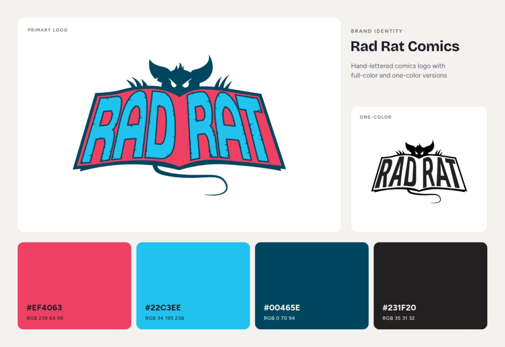
The logo takes its cue from the classic 1960s Batman logo, a shape comic readers recognize instantly. Instead of a bat, it features a rat peeking over an open comic book, putting the channel’s subject and personality into one mark. Spiky, distressed hand lettering adds energy and the worn texture of a well-loved back issue.
The color choice comes straight from comic book history. Old comics were printed with a limited set of base inks, and magenta and cyan were everywhere on the newsstand. I pushed those colors into a slightly customized hot pink and cyan that feel vintage and pop off a screen. I also created a one-color version for print and other uses where full color isn’t an option.
The result
Rad Rat Comics has a logo that reads as classic comics at a glance and gives the channel a strong identity across YouTube, social media, and print. It’s one of my favorite marks, and a good example of how research into an audience’s visual history can make a brand feel like it belongs.
Want a logo with real personality?
Whether your brand is playful, retro, or completely your own, UpTime Web Services designs logos that connect with the people you want to reach. I work with businesses and creators in Greeley, Timnath, and Windsor. Request a quote and let’s talk.